Version 8.400 sees the release of a range Charts, Graphs and Gauges for users of Infusion. Access to each Chart is controlled under the Staff members’ account.
To set this up select the Charts tab under the Staff Member within Staff\Manage Staff.
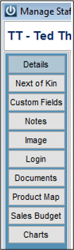
This will display a range of available charts. To enable a Staff member to have access check the box next to the chart name.

From the bottom of the screen you may also select Check All or Un Check All
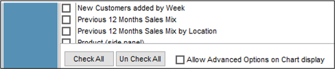
Each Staff member will by default be a standard user which will allow them to create charts and change the chart type.
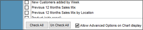
A Staff member may be given advanced options by checking the box. This will give them the ability to print and export the chart, reformat, and redesign the chart.
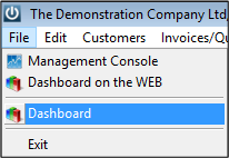
Once the Staff member has been given access to the charts they will now be available under the File \ Dashboard menu.
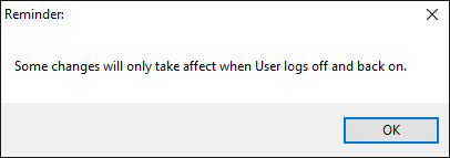
Once these settings have been made you will need to have the Staff member log off and back into Infusion.
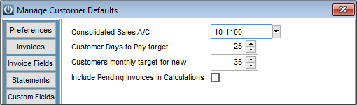
Under Admin \ Defaults \ Manage Customer Defaults \ Charts set the following as required:
From the File menu select Dashboard
The system will now prepare all of the Charts

Note: depending on the size of the data file and the network this may take several minutes to do.
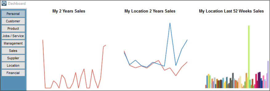
The first Tab – Personal will contain Charts that are specific to the person logged in.
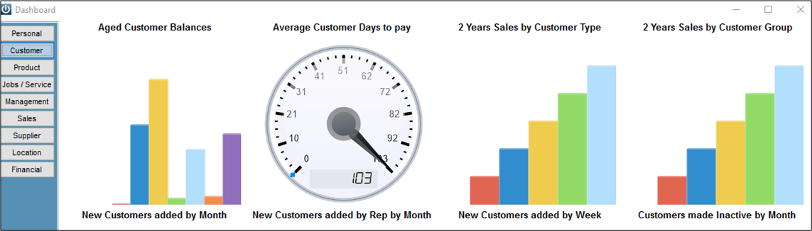
The Customers Tab
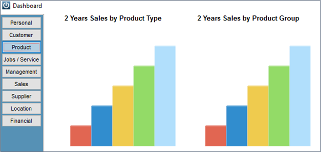
Product
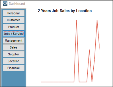
Jobs / Service
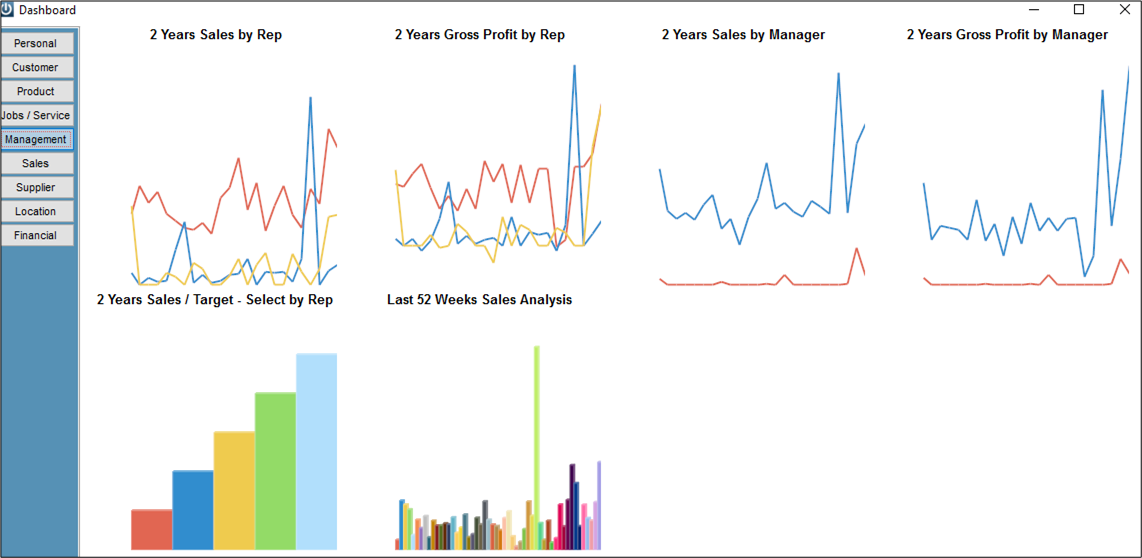
Management
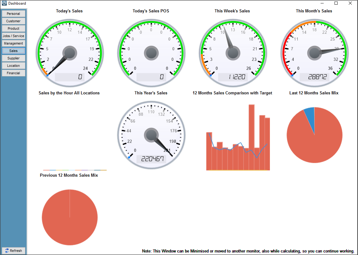
Sales
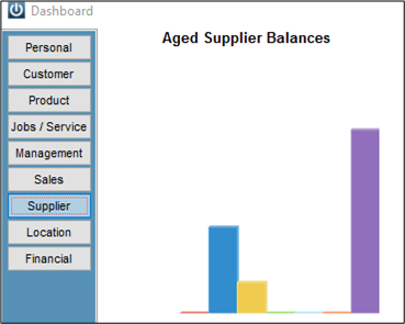
Suppliers
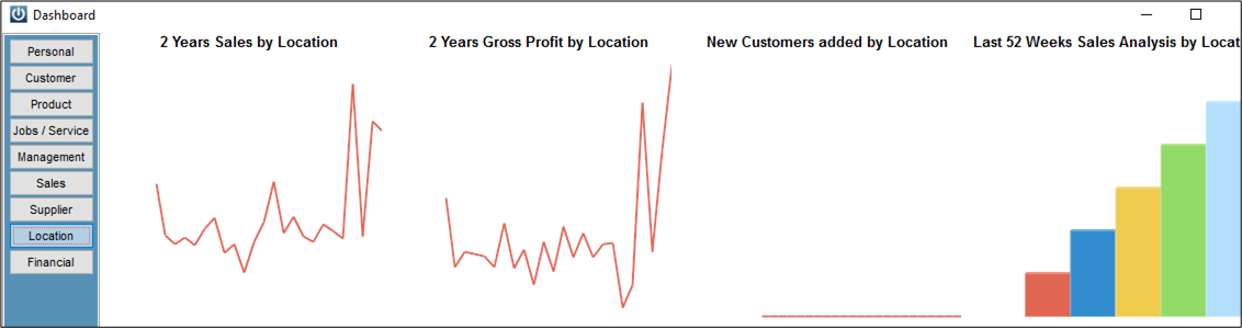
Location
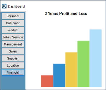
Financial
Using the different types of Charts, Graphs and Gauges
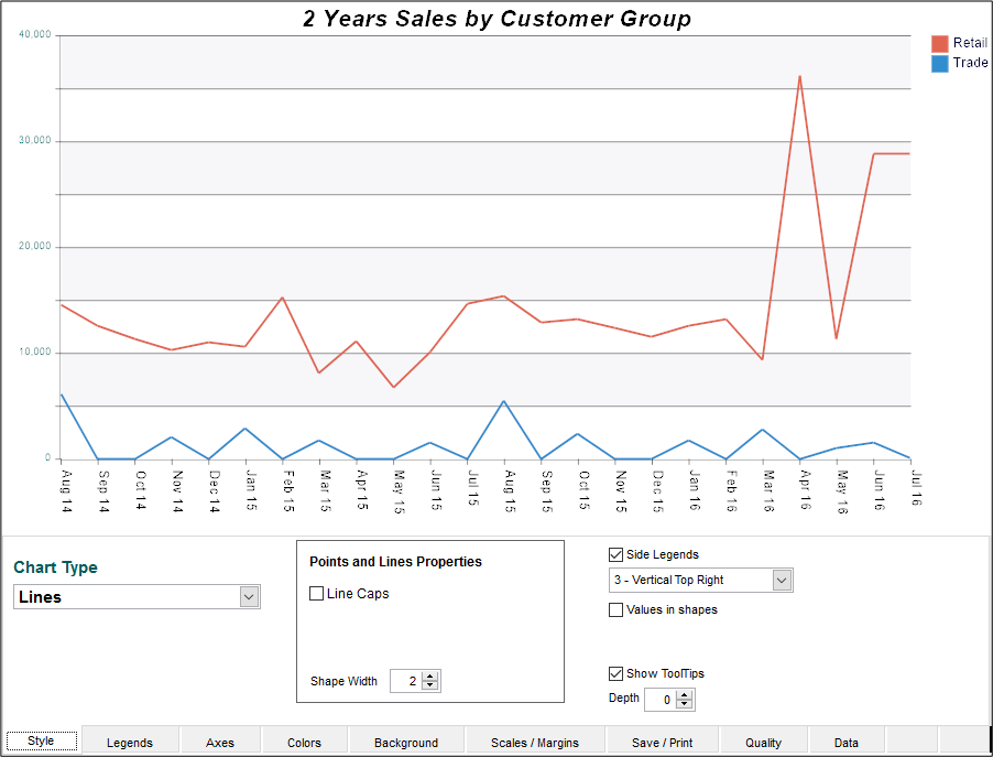
Double click on the chart to open it and view the ranges. Multiple charts can be open at the same time.
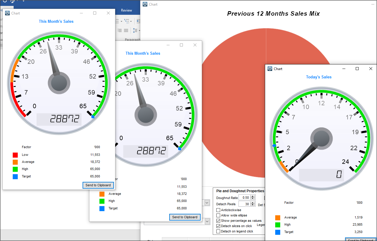
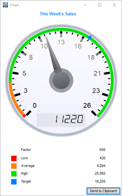
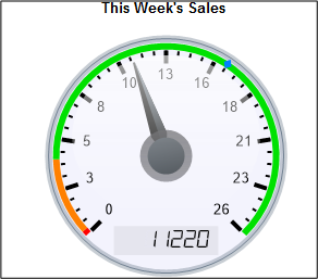
At the bottom of the Gauge we can now see the Low, Average, High, and Target. These figures are derived from the financial budgets.
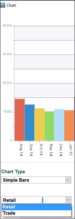
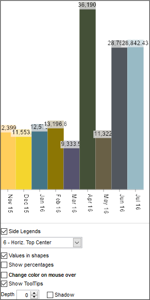
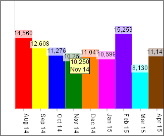
The Bar Graph
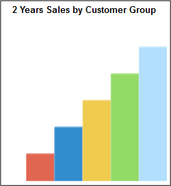
Double click on the Bar Chart.
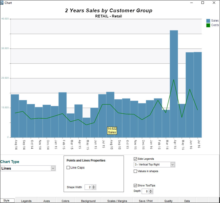
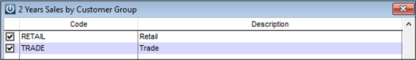
You can now select from the range of Groups.
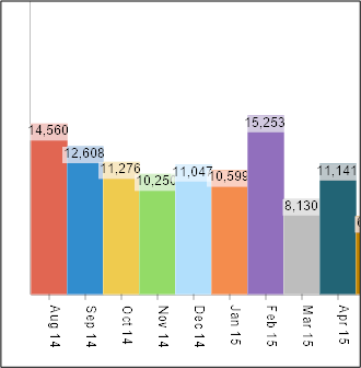
Selecting the Chart Type
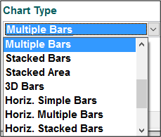
You can change the chart type to suit. These changes will be saved per user.
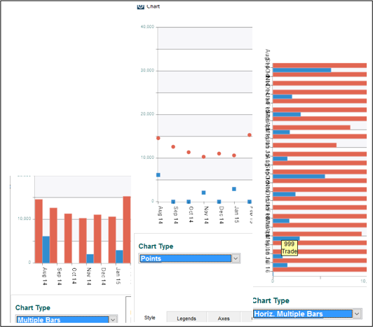
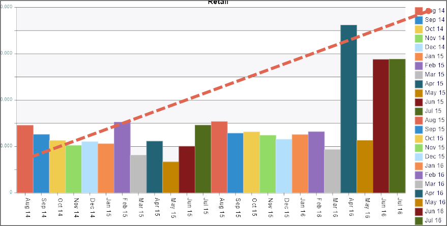
Some charts will operate differently if there are multiple lines to report on.
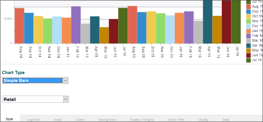
Going to Simple Bars will require one range option to be selected at a time.
Clicking a value in the the legend will show a link to the corresponding data in the chart.
Standard vs. Advanced User
Standard users have access to a limited number of options at the footer of the Chart.
Advanced users can change all formatting options for the Chart.
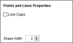
The number of additional options to customise the Chart / Graph will be dependent on the Graph / Chart Type selected.
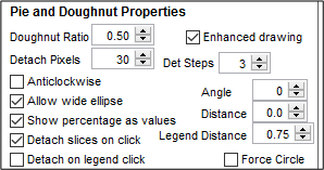
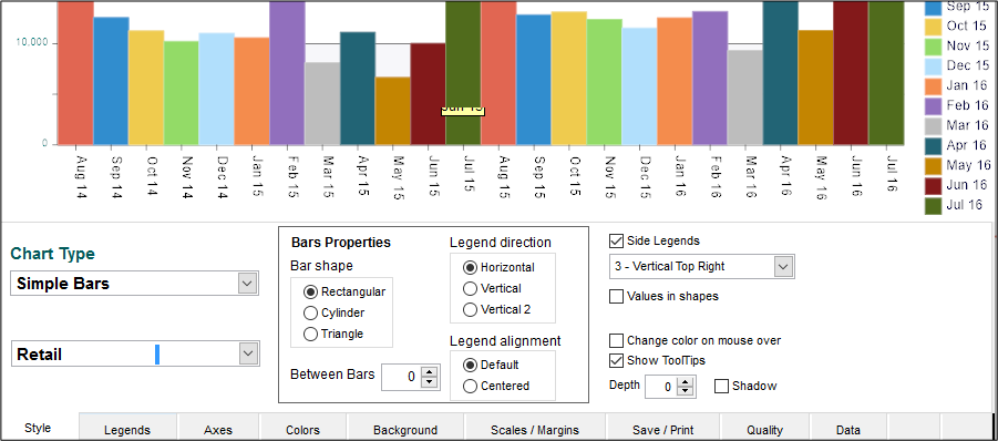
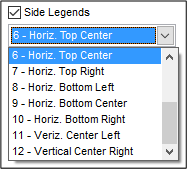
Legends can be changed.
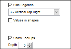
Values can be set to show on Shapes
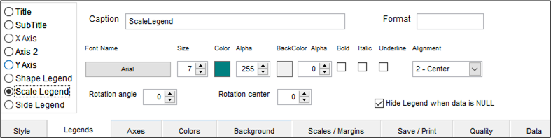
Legends Tab
Here fonts, colours, presentation and alignment of Legends can be adjusted.
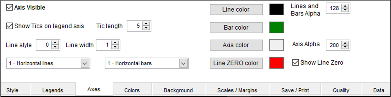
Axes Tab
The Axes tab allows changing of colours, turning the axis on and off, and adjusting as required.
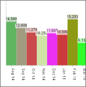
Colours Tab
The colour scheme for the Chart and overall effect can be set from here.
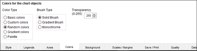
Basic or Custom colours can be used
Random or Gradient colours can be set

Background Tab
The colour for the background of the Chart can be set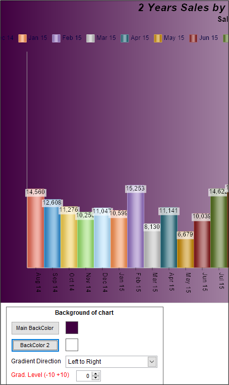
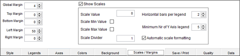
Scales / Margins Tab
Some graphs and charts may need to be adjusted to fit the screen if legends are moved.
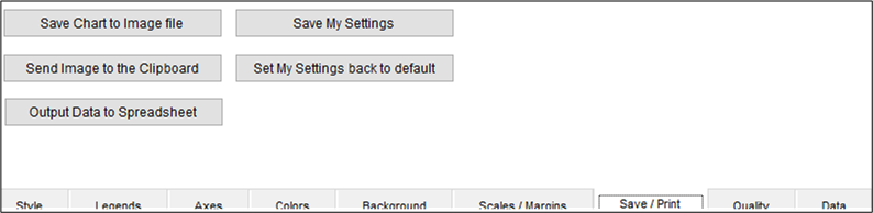
Save / Print Tab
This tab will allow you to save any personalised settings that you have selected. These changes will be for the logged in user only allowing all Staff to customise their own Charts / Graphs.
Quality Tab
The Quality tab will allow you to adjust various presentation settings.

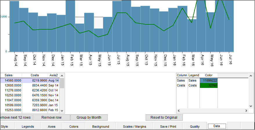
Data Tab
The Data tab will allow you to quickly and easily review the raw data, remove a year, row or group.
Comments
0 comments
Please sign in to leave a comment.